Headline · Feed
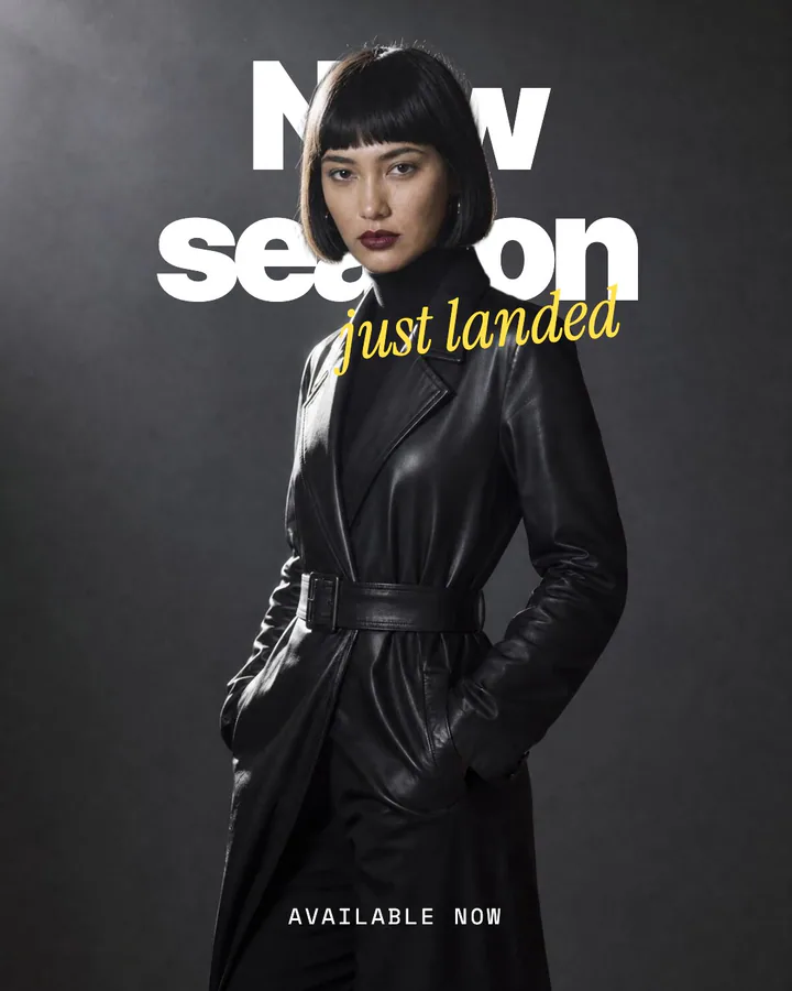
The new-season headline
A big line behind the model and a small one breaking in: the layout most strong fashion ads reach for.
Sample words for a leather trench.
Make this with your product →Ad recipes · Headline
The most common strong ad in our study of 1,718 is a short line set large over a full-bleed picture. Here are seven ways to build it, from a word standing behind the product to a poster on a flat colour.
Beta · Reviewed by hand · Welcome credits to start
01 / When it works
A season, a collection or a mood you can name in two to four words.
A picture that is already strong, where the line frames it instead of explaining it.
A first ad to test before you spend on anything more elaborate.
02 / The recipes
Each is drawn by the Ads studio on a sample picture, with sample words for an imaginary product. Yours takes your product, your colours and your words.
A big line behind the model and a small one breaking in: the layout most strong fashion ads reach for.
Sample words for a leather trench.
Make this with your product →One giant word stands behind the product, so the picture and the word read as a single thing.
Sample words for a face serum.
Make this with your product →One word above, one below, the model between them: short enough to read at a glance on a phone.
Sample words for a tailored blazer.
Make this with your product →The picture keeps the top of the frame; the headline sits in the lower third, clear of the face.
Sample words for washed denim and a white shirt.
Make this with your product →No picture needed: a flat colour and one confident line, the quickest ad to make and to test.
Sample words for a range of white shirts.
Make this with your product →Heavy caps with one script word cutting across them: a headline with a voice, on a flat colour.
Sample words for a capsule wardrobe.
Make this with your product →Two words that touch the edges frame a close portrait, so the type is as big as the face.
Sample words for a skin serum.
Make this with your product →The place name and its coordinates on a picture in evening light: a postcard people keep, not an ad they scroll past.
Sample words for a hotel on an archipelago island.
Make this with your product →The hour and a plain invitation on a table mid-meal: the decision is about tonight, so the ad says when.
Sample words for a small restaurant with free tables on a Thursday.
Make this with your product →The athlete at the hardest moment with two short words: the picture proves the use, the words name it.
Sample words for a winter running jacket.
Make this with your product →03 / How it's built
Each recipe is a real Misu layout. The headline is live type, fitted to its box, so any words stay as large as the layout allows. Where a layout supports it the headline can sit behind the subject; that needs a cut-out of your picture, which costs tokens once per picture and is priced before you run it. Every recipe also works with the line in front.
Layouts used: Headline over figure · Big word behind · Split headline · Lower headline · Big statement · Mixed type · Edge to edge · Postcard · One line
Questions
Two to four words reads best at phone size. Each layout lists its limit in characters, and the editor shrinks the type to fit rather than cutting your words.
No. Behind the model needs a cut-out of your picture. Every recipe also works with the headline in front, and several are type only, on a flat colour.
The other recipes
Get started
Misu is in beta and open to brands, agencies, freelancers and designers. We review every request and email your invite once it's approved, and every new studio starts with welcome credits.
BETA · REVIEWED BY HAND · FOUNDING PRICING LOCKED


