Split screen · Feed
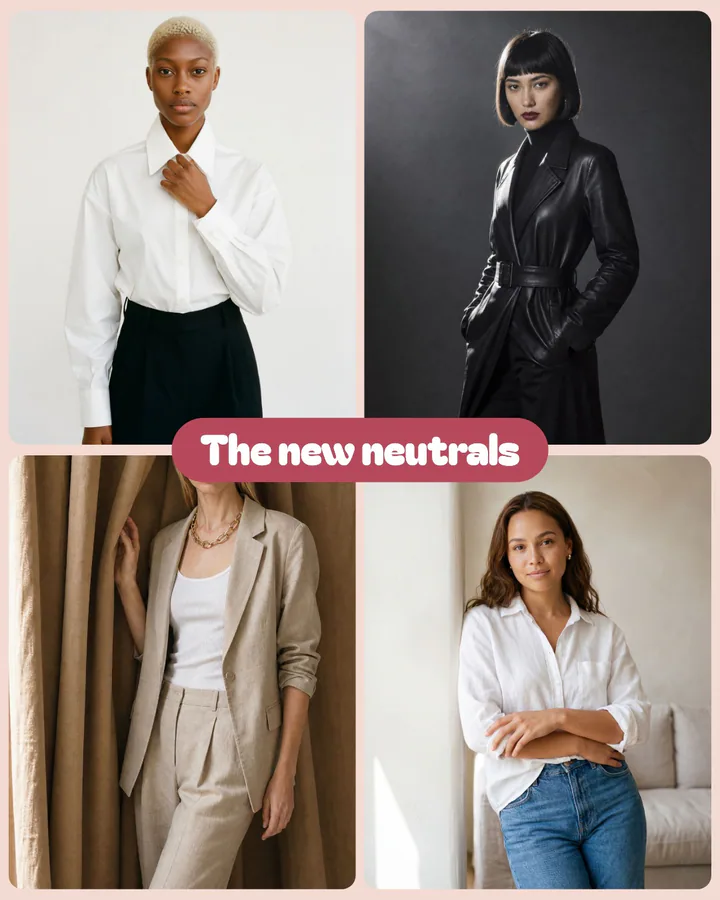
The grid of four
Four pictures from one shoot in a grid, one short line on a pill in the middle.
Sample words for a neutral collection.
Make this with your product →Ad recipes · Split screen
Two or four pictures in one frame, with one short line where they meet. A way to show range without a carousel.
Beta · Reviewed by hand · Welcome credits to start
01 / When it works
A piece styled two ways, or a collection shown in four pictures.
A name-and-price panel beside the product.
A link-ad size, where two halves can tell a styling story such as day to night.
02 / The recipes
Each is drawn by the Ads studio on a sample picture, with sample words for an imaginary product. Yours takes your product, your colours and your words.
Four pictures from one shoot in a grid, one short line on a pill in the middle.
Sample words for a neutral collection.
Make this with your product →Two pictures stacked with a short line where they meet: a piece, styled two ways.
Sample words for white shirts.
Make this with your product →Two rounded panels on a dark ground: the name and price on one, the photo on the other.
Sample words for a leather trench.
Make this with your product →Two pictures side by side with labels and an arrow between them: one wardrobe, two moments.
Sample words for a wardrobe.
Make this with your product →03 / How it's built
The grid places four pictures with a headline on a pill. The stacked pair places two with a line where they meet. The panels put name and price on one card and the photo on another. The wide pair puts two pictures side by side with labels and an arrow. Your product's own pictures fill the cells.
Layouts used: Grid of four · Two photos · Split panels · Before / after
Questions
Not yet. No layout draws a comparison table, and we would rather list what exists than promise what does not.
The wide pair draws two pictures with labels and an arrow, which suits a styling story. For results such as skin, use only your own real pictures and check each platform's rules.
The other recipes
Get started
Misu is in beta and open to brands, agencies, freelancers and designers. We review every request and email your invite once it's approved, and every new studio starts with welcome credits.
BETA · REVIEWED BY HAND · FOUNDING PRICING LOCKED


